STVS x Ta-daaa x Pascal Viscardi: an identity aligned with the field

Revealing an identity means asserting more clearly what matters. In 2025, we chose to evolve our image to make it even more faithful to who we are: a hands-on, committed, and precise company—and above all, and more than ever, human. This graphic and verbal transformation is the result of a creative collaboration between our team, the Geneva-based Ta-daaa studio, and Pascal Viscardi. Together, we designed a useful, coherent, and embodied identity.

A transformation guided by our vision

For twenty years, we have supported our clients in critical, technical, and human environments. This renewed identity is part of this continuity: it allows us to better convey who we are, with clarity and accuracy. It makes visible the principles that have always driven us: trust, high standards, and presence. It also allows us to see, at a glance, our way of working: simple, structured, and committed. Nothing has been added. What matters has simply been highlighted.

A visual language rooted in usage

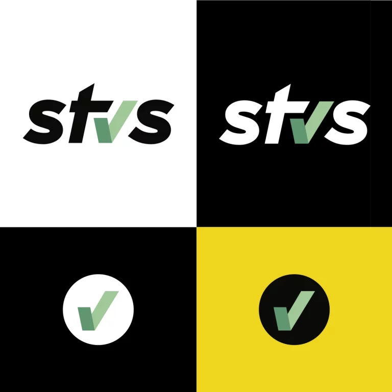
Shapes, lines, pictograms: everything stems from our daily lives. All visual elements are designed for a specific use. The graphic identity rests on solid, sober, and modular foundations. Legible typography, stable colors, fluid animations: the whole creates a system that supports business gestures, streamlines reading, and supports comprehension. The website, designed with the same dynamics, extends this approach to the interface. It becomes a tool for dialogue, a readable, responsive space, aligned with the expectations of our users. This design speaks our language, and that of our customers – yours.

Shades in the service of clarity

Sober, solid, and poised, the colors reflect our approach: calm, consistent, and accurate. Each fulfills a specific role: structuring information, creating reference points, and providing space for reading. Light gray soothes, dark blue anchors, and neutral tones promote concentration. This palette follows the gesture, supports the action, and guides the gaze. The entire team fully identifies with it. These shades speak volumes, with a tone that reflects us.

Two perspectives, one requirement

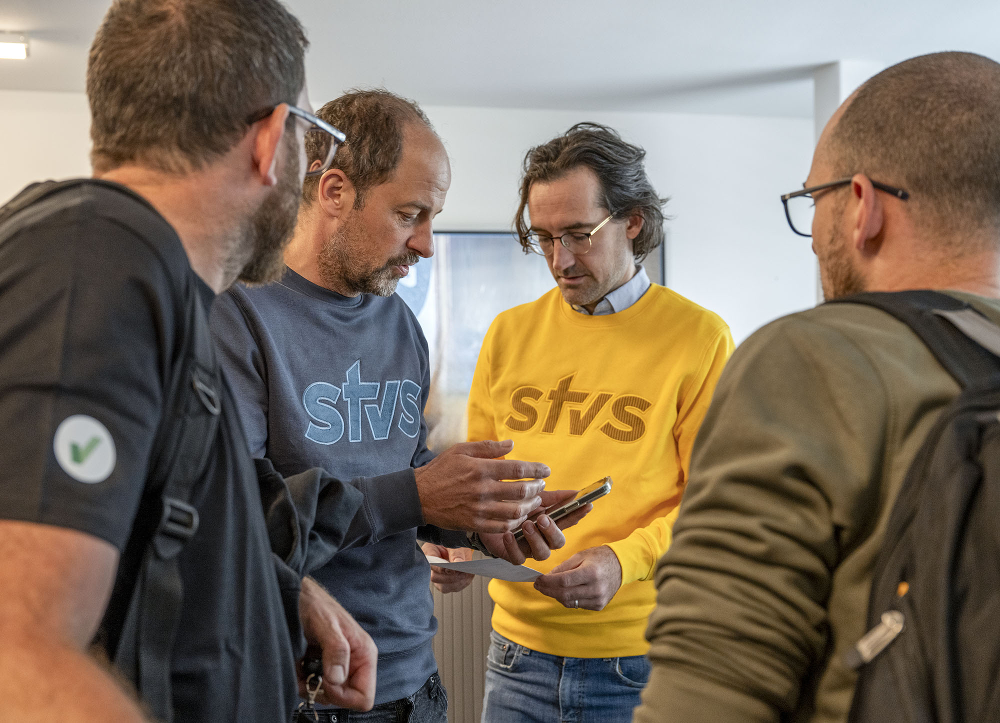
This visual evolution was born from a meeting in Geneva. Ta-daaa studio – founded by Valérie Pierrehumbert and Jessica Friedling – shares with STVS a vision of useful and sustainable design. Together, we sought the right gesture, one that illuminates, supports, and facilitates. joint joint work on the pictograms tell about our professionsTheir attention to detail, their mastery of visual ergonomics, and their culture of connection enrich each component. What we have designed together is based on listening, adaptability, and respect for reality and situations. But also for your needs. It is this collective intelligence that allows us to create a graphic language capable of speaking for us, and with you. From then on, we wanted to push even further... After the look, the gestures, the shapes. We also had to match the words.

Words that translate a profession

At the same time, we refined our way of speaking. To ensure that content and form move forward together, we called on Pascal Viscardi. His perspective on brand languages has allowed us to structure an expression as clear as our method. A way of saying designed to enlighten, reassure, connect. This tone is a direct extension of our posture: s without being cold, accessible without losing its demands, human at every stage. It gives voice to our commitments, a form to our relationship, a place for your expectations. Here, the words guide, accompany, open the dialogue. They translate what is important to us: taking the time, doing things with precision, remaining fully attentive.

Inspired and purely Genevan creation

Three energies, one goal: imagining a fair, useful, sustainable identity. STVS, Ta-daaa And Pascal Viscardi joined forces in Geneva, driven by mutual listening and a constant concern for consistency. Together, we shaped a visual and verbal grammar that reflects our gestures, our uses, our posture. This project was built step by step, with attention, attention to detail and a shared desire: to create a tool that is faithful to the reality on the ground. More than a design, it is a way of thinking about relationships. More than a language, a way of conveying what connects us.

A site designed as a trusted tool

Behind each section lies a clear intention: to simplify, guide, and promote expertise. The experience has been designed to support your usage, with fluid navigation, readable content, and an interface that facilitates understanding. Each graphic component follows this logic: to serve the action, sustain attention, and make the journey enjoyable. This site extends our service, reflects our stance, and invites you to discover the multiple facets of our commitment—particularly through contents like the one you're reading now. A useful platform, carefully built to better support you. Always.

Perceive differently, access more easily

Beyond the form, this project carries a promise of experience. A clear interface, designed to reassure without overloading. Graphic gestures that guide without distracting. A voice that explains without imposing. Everything converges towards a fluid, pleasant, accessible use, at the service of those who interact with us every day. This new identity doesn't dress up a brand: it translates a stance. It makes our way of doing things tangible. It transforms the relationship with information into a moment of exchange, readable, respectful, and open. It is this connection with the user that gives meaning to what we have built.